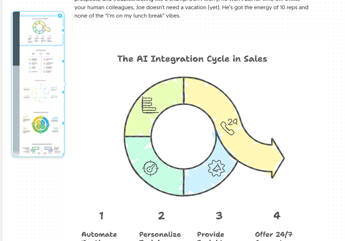
Today, I decided to put one of my recent tools to the test: Napkin.AI. If you haven't heard of it, Napkin.AI is an incredible tool that turns text into visuals—graphs, charts, and data-driven insights—just from the content you provide. After playing around with it, I found myself amazed at how quickly it could turn simple text into a visually engaging representation. Naturally, I couldn't resist turning this new tool into an experiment.
Since I had a LinkedIn post scheduled to be written today, I saw this as a perfect opportunity to give Napkin.AI a shot. The goal was simple: turn my thoughts into something visually impactful without losing any of the heart of the message.
The Process: From Text to Chart
I started with a LinkedIn post I had already drafted about how AI tools like Gong.io and HubSpot are transforming sales and customer relationships. The post discussed AI’s role in analyzing customer interactions and improving sales effectiveness. But here's the thing: while I was proud of the content, I knew the text alone wouldn’t necessarily stand out in a crowded LinkedIn feed. I wanted something that would grab attention.
That’s when I decided to feed my content into Napkin.AI. To my delight, the tool automatically generated a sleek graph based on the core points in my post. The chart gave a visual representation of the impact of AI on sales productivity, including how AI tools streamline workflows, analyze customer conversations, and ultimately drive win rates. What took me paragraphs to explain, Napkin.AI turned into a visual summary that was easy to understand and engaging.

Why Napkin.AI Was the Right Choice for This Post
I’ve always believed in the power of visuals to reinforce ideas. Whether it’s a graph, a chart, or a simple infographic, visuals are a great way to convey complex information quickly and clearly. In today’s fast-paced digital world, grabbing attention in a feed full of text is a challenge. But by pairing my thoughtful message with a well-designed chart, Napkin.AI helped me make my post more engaging and shareable.
But it wasn’t just about making things look pretty. What impressed me most was how Napkin.AI turned the concepts I was sharing into something even more digestible. The ability to instantly turn text into meaningful visuals is a game-changer for anyone looking to make an impact in sales, marketing, or customer enablement. It gives you the ability to tell a story in multiple ways, making your content even more powerful.
A LinkedIn Post, Made Easier
Once the chart was ready, all I had to do was tweak my original post and add the chart as a visual. It was so simple! The experiment turned out to be incredibly useful because not only did I have a great-looking post to share, but I also learned something valuable about how AI can enhance the process of content creation.
And here's the thing: I didn’t just use Napkin.AI to make my post look better—I used it to amplify my message. Sometimes, the best way to get your point across is by showing it rather than just saying it. AI-powered tools like Napkin.AI make that so much easier.

Final Thoughts: Embracing AI in Content Creation
This little experiment was more than just testing a new tool. It reminded me of the incredible potential that AI has to improve the way we communicate and share information. As someone who loves helping people use technology to enhance their skills, seeing AI bring my content to life in this way was incredibly exciting.
So, as I wrap up this post and prepare to share it, I’m already thinking about how I can keep using tools like Napkin.AI to level up my content strategy. Whether you're looking to create compelling visuals or streamline your content creation process, AI is the perfect companion for the job.
Oh, and if you find this post valuable, feel free to click like and share!
#AI #SalesEnablement #CustomerEnablement #AIInBusiness #ContentCreation #NapkinAI #TechTools #AIForSales #SalesTech #DigitalTransformation #LinkedInTips #RockstarContent #AIContent
